The goal of building the website for the breakfast company was to create a seamless and visually appealing experience that highlights their signature dishes. Prioritizing ease of use, we designed an intuitive layout that allows customers to quickly explore the menu, discover mouthwatering meals, and effortlessly navigate the ordering process.
OBJECTIVE:
The objective of designing the breakfast company’s website was to create a user-friendly platform that seamlessly showcases their signature dishes. We focused on intuitive navigation, ensuring customers could easily explore the menu and engage with the brand.
PURPOSE:
The purpose of redesigning the breakfast company’s website was to modernize its outdated digital presence while enhancing ease of use and showcasing their signature dishes. We reimagined the site with a clean, intuitive layout, making navigation effortless for customers.
DESIGN IMPLEMENTATION
COLOR PALETTE
We chose a color palette of yellow, light brown, and light red to evoke a hunger response through color psychology. Yellow stimulates warmth and energy, light brown adds a sense of comfort. light red enhances appetite and excitement. Together, these colors create an inviting and delicious visual experience.
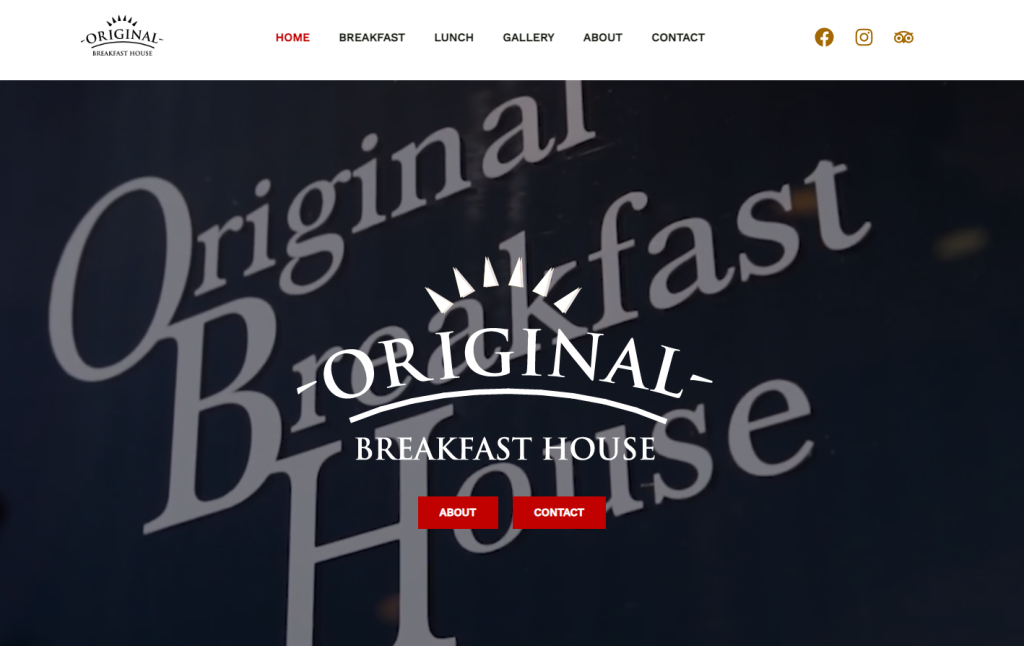
LOGO DESIGN
We designed a simple, classy logo to reflect the brand’s elegant yet welcoming home-base aesthetic. By keeping the design clean and timeless, we ensured it complements the brand’s warmth and sophistication without overwhelming its identity.
LOGO DESIGN
We designed a simple, classy logo to reflect the brand’s elegant yet welcoming home-base aesthetic. By keeping the design clean and timeless, we ensured it complements the brand’s warmth and sophistication without overwhelming its identity.
LOGO DESIGN
We designed a simple, classy logo to reflect the brand’s elegant yet welcoming home-base aesthetic. By keeping the design clean and timeless, we ensured it complements the brand’s warmth and sophistication without overwhelming its identity.
WEBSITE THEME
We chose a simple, classy theme for the website to ensure the menu and food items remained the focal point. By keeping the design clean and refined, we eliminated distractions and created a seamless browsing experience that puts the spotlight on the brand’s signature dishes.
WEBSITE THEME
We chose a simple, classy theme for the website to ensure the menu and food items remained the focal point. By keeping the design clean and refined, we eliminated distractions and created a seamless browsing experience that puts the spotlight on the brand’s signature dishes.
WEBSITE THEME
We chose a simple, classy theme for the website to ensure the menu and food items remained the focal point. By keeping the design clean and refined, we eliminated distractions and created a seamless browsing experience that puts the spotlight on the brand’s signature dishes.