Unbiased guidance and tailored solutions to help clients grow.
GOAL:
We streamlined the site’s structure, making complex offerings more accessible through clear messaging and intuitive navigation. Strategic call-to-actions were incorporated throughout to drive engagement and conversions, ensuring visitors could seamlessly connect with the brand.
OBJECTIVE:
We refined the layout with a sleek, contemporary design that enhances readability and navigation. Clear call-to-actions were strategically placed to guide visitors toward key services and conversions, ensuring a seamless and intuitive experience. The result is a polished, professional website that effectively communicates the brand’s expertise and drives meaningful interactions.
PURPOSE:
The purpose of redesigning the website was to create a streamlined design to improve readability and navigation while incorporating clear call-to-actions that guide visitors seamlessly toward key services. This refreshed approach not only elevates the brand’s digital presence but also ensures a more intuitive and effective way for users to connect and take action.
DESIGN IMPLEMENTATION
COLOR PALETTE
Deep purple symbolizes sophistication and leadership, while light purple adds a touch of warmth and approachability. Gold reinforces a sense of prestige and excellence, creating a balanced visual identity that feels both inviting and authoritative.
COLOR PALETTE
Deep purple symbolizes sophistication and leadership, while light purple adds a touch of warmth and approachability. Gold reinforces a sense of prestige and excellence, creating a balanced visual identity that feels both inviting and authoritative.
COLOR PALETTE
Deep purple symbolizes sophistication and leadership, while light purple adds a touch of warmth and approachability. Gold reinforces a sense of prestige and excellence, creating a balanced visual identity that feels both inviting and authoritative.
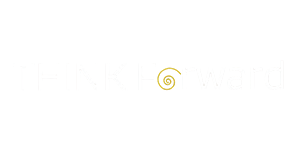
LOGO DESIGN
Its strong design effectively communicated the company’s identity, aligning with the refreshed website without the need for modification. By keeping the existing logo, we maintained brand recognition and consistency while focusing on modernizing the overall digital experience.
LOGO DESIGN
Its strong design effectively communicated the company’s identity, aligning with the refreshed website without the need for modification. By keeping the existing logo, we maintained brand recognition and consistency while focusing on modernizing the overall digital experience.
LOGO DESIGN
Its strong design effectively communicated the company’s identity, aligning with the refreshed website without the need for modification. By keeping the existing logo, we maintained brand recognition and consistency while focusing on modernizing the overall digital experience.
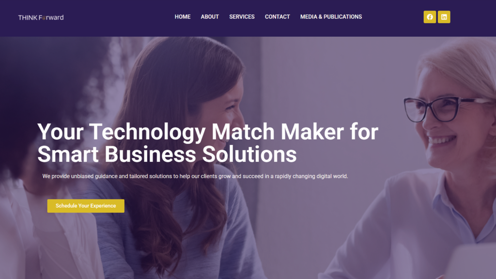
WEBSITE THEME
We chose a clean, professional website theme to ensure the brand’s expertise and services were presented with clarity and sophistication. This approach enhances readability, streamlines navigation, and creates a seamless user experience.
WEBSITE THEME
We chose a clean, professional website theme to ensure the brand’s expertise and services were presented with clarity and sophistication. This approach enhances readability, streamlines navigation, and creates a seamless user experience.
WEBSITE THEME
We chose a clean, professional website theme to ensure the brand’s expertise and services were presented with clarity and sophistication. This approach enhances readability, streamlines navigation, and creates a seamless user experience.