The goal of branding and creating content for the açaí bowl shop was to craft a visual identity that feels as fresh and exciting as the bowls themselves. We aimed for a cool, vibrant aesthetic that captures the energy of a health-conscious, trend-savvy audience while maintaining a sense of authenticity and fun.
OBJECTIVE:
Through bold visuals, engaging storytelling, and a fresh aesthetic, the brand was designed to feel inviting and dynamic, drawing in customers who crave both flavor and experience. Every element, from social media content to in-store design, was crafted to create a buzz and make the shop a must-visit destination.
PURPOSE:
The purpose was to build a cool, vibrant brand presence that excites customers and drives foot traffic. Through eye-catching visuals, engaging messaging, and a fresh, dynamic aesthetic, the content was designed to make the shop stand out and attract a loyal community. Every piece of content worked together to create an inviting atmosphere, turning online interest into real-world visits.
DESIGN IMPLEMENTATION
COLOR PALETTE
We chose green, light purple, and dark purple to create a fresh and vibrant color palette that reflects nature, health, and creativity. Green represents freshness and vitality, while the purples add a sense of richness and playfulness, making the brand feel both inviting and unique.
COLOR PALETTE
We chose green, light purple, and dark purple to create a fresh and vibrant color palette that reflects nature, health, and creativity. Green represents freshness and vitality, while the purples add a sense of richness and playfulness, making the brand feel both inviting and unique.
COLOR PALETTE
We chose green, light purple, and dark purple to create a fresh and vibrant color palette that reflects nature, health, and creativity. Green represents freshness and vitality, while the purples add a sense of richness and playfulness, making the brand feel both inviting and unique.
LOGO DESIGN
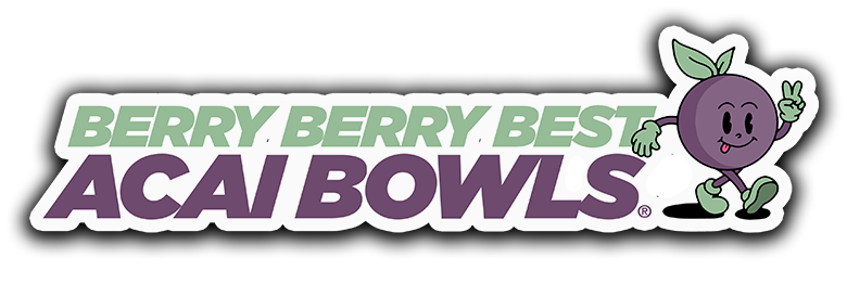
We chose an açaí berry as the logo to create an instantly recognizable connection to the shop’s core product and its fresh, healthy appeal. The berry symbolizes authenticity, vitality, and the vibrant flavors customers can expect, making the brand feel natural, inviting, and true to its roots.
LOGO DESIGN
We chose an açaí berry as the logo to create an instantly recognizable connection to the shop’s core product and its fresh, healthy appeal. The berry symbolizes authenticity, vitality, and the vibrant flavors customers can expect, making the brand feel natural, inviting, and true to its roots.
WEBSITE THEME
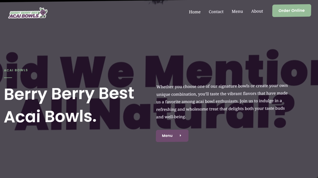
We chose green, light purple, and dark purple to create a fresh and vibrant color palette that reflects nature, health, and creativity. Green represents freshness and vitality, while the purples add a sense of richness and playfulness, making the brand feel both inviting and unique.
WEBSITE THEME
We chose green, light purple, and dark purple to create a fresh and vibrant color palette that reflects nature, health, and creativity. Green represents freshness and vitality, while the purples add a sense of richness and playfulness, making the brand feel both inviting and unique.
WEBSITE THEME
We chose green, light purple, and dark purple to create a fresh and vibrant color palette that reflects nature, health, and creativity. Green represents freshness and vitality, while the purples add a sense of richness and playfulness, making the brand feel both inviting and unique.