For this hair care brand, the goal was to design a visual identity that perfectly balances playfulness and sophistication. The vision was to create a brand that feels bright and fun, capturing the joy of self-care, while maintaining a classy, refined aesthetic that speaks to the quality and luxury of the product. Every detail, from the color palette to typography, was carefully crafted to evoke a sense of energy and elegance, ensuring the brand resonates with customers who appreciate both style and substance.
OBJECTIVE:
The objective for branding this hair care company was to craft an experience that seamlessly blends style with functionality. In designing the website, the goal was to create an intuitive, easy-to-navigate platform that showcases the products in a visually appealing way. With clear, user-friendly navigation, we ensured that customers could effortlessly explore the product range while also highlighting the unique qualities and benefits of each item. The design prioritizes both simplicity and impact, providing a smooth journey from discovery to purchase.
PURPOSE:
The purpose behind branding this hair care company with vibrant energy was to capture the essence of vitality and confidence that comes with great hair care. The bold, lively aesthetic reflects a fun yet sophisticated approach, making the brand feel fresh and approachable. In designing the website, the goal was to ensure a seamless, user-friendly experience that puts the focus on the products. With intuitive navigation and dynamic visuals, the website highlights each product’s unique features while maintaining a visually engaging, easy-to-explore layout for customers.
DESIGN IMPLEMENTATION
COLOR PALETTE
We chose a flat greenish yellow for energy and vitality, a light purple for elegance and balance, and a dark flat orange for warmth and depth, creating a vibrant, confident palette.
COLOR PALETTE
We chose a flat greenish yellow for energy and vitality, a light purple for elegance and balance, and a dark flat orange for warmth and depth, creating a vibrant, confident palette.
COLOR PALETTE
We chose a flat greenish yellow for energy and vitality, a light purple for elegance and balance, and a dark flat orange for warmth and depth, creating a vibrant, confident palette.
LOGO DESIGN
We chose a graffiti-inspired, modern logo to capture the brand’s youthful, bold energy and to resonate with a sense of urban style. The bright, dynamic design reflects the brand’s vibrant personality and its appeal to a fun-loving, confident audience.
LOGO DESIGN
We chose a graffiti-inspired, modern logo to capture the brand’s youthful, bold energy and to resonate with a sense of urban style. The bright, dynamic design reflects the brand’s vibrant personality and its appeal to a fun-loving, confident audience.
LOGO DESIGN
We chose a graffiti-inspired, modern logo to capture the brand’s youthful, bold energy and to resonate with a sense of urban style. The bright, dynamic design reflects the brand’s vibrant personality and its appeal to a fun-loving, confident audience.
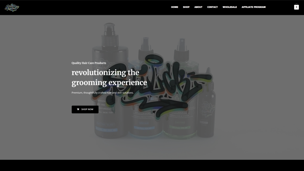
WEBSITE THEME
We chose a custom website theme to ensure a unique, tailored experience that reflects the brand’s personality while remaining user-friendly. The bright and bold design elements were incorporated to match the vibrant energy of the brand, creating an engaging and memorable online presence.